Bacio di Latte · Higienópolis
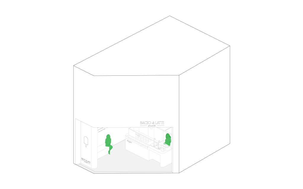
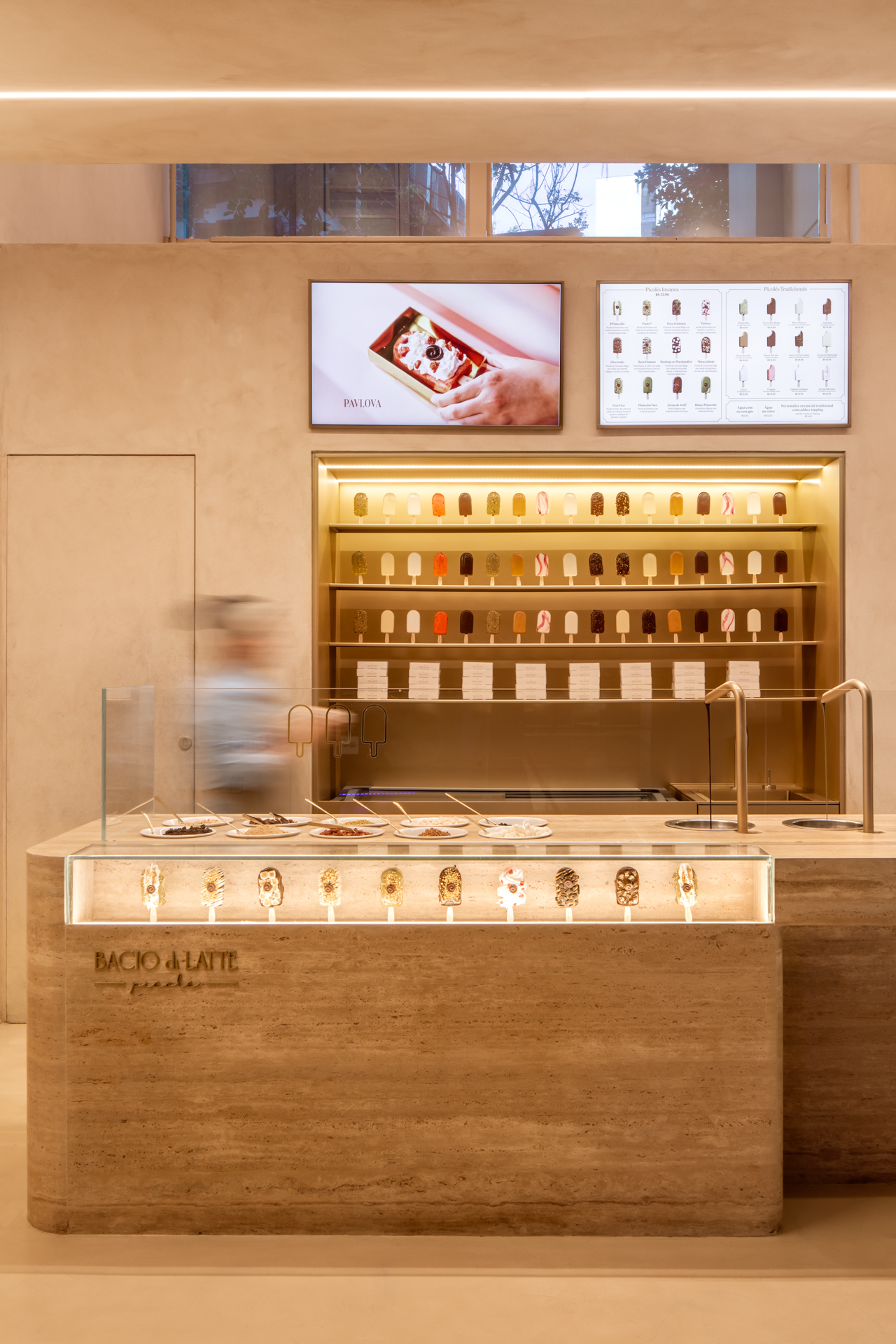
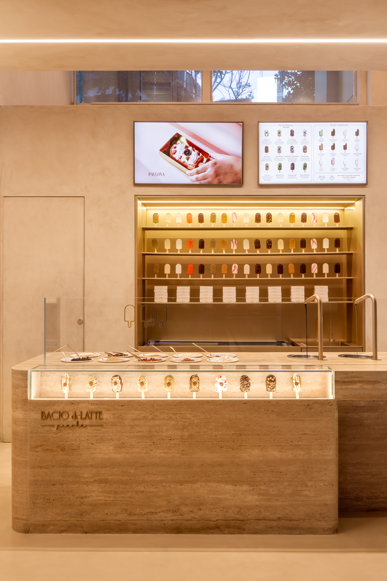
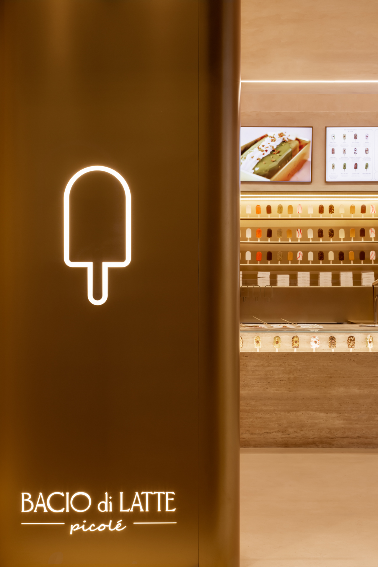
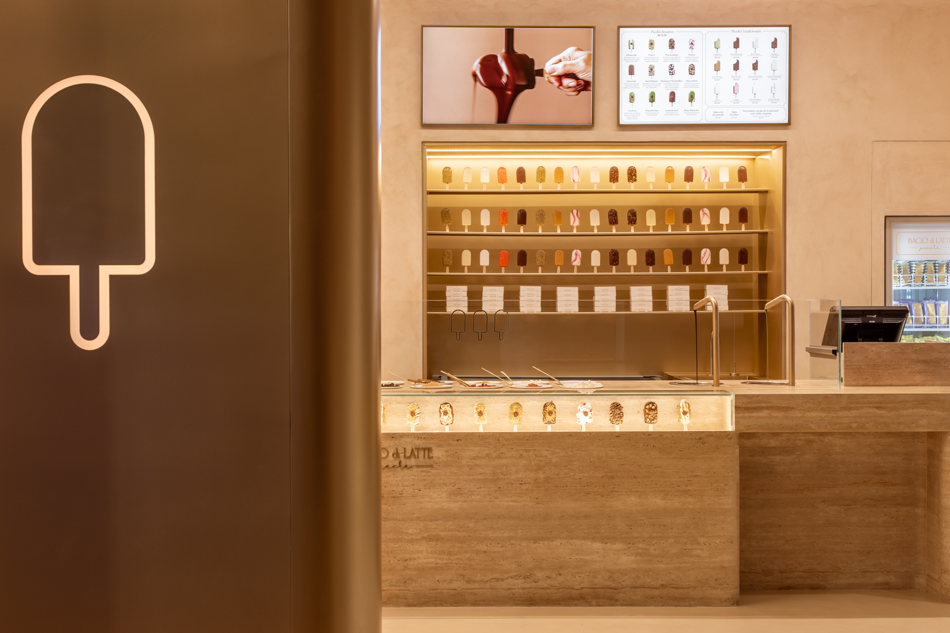
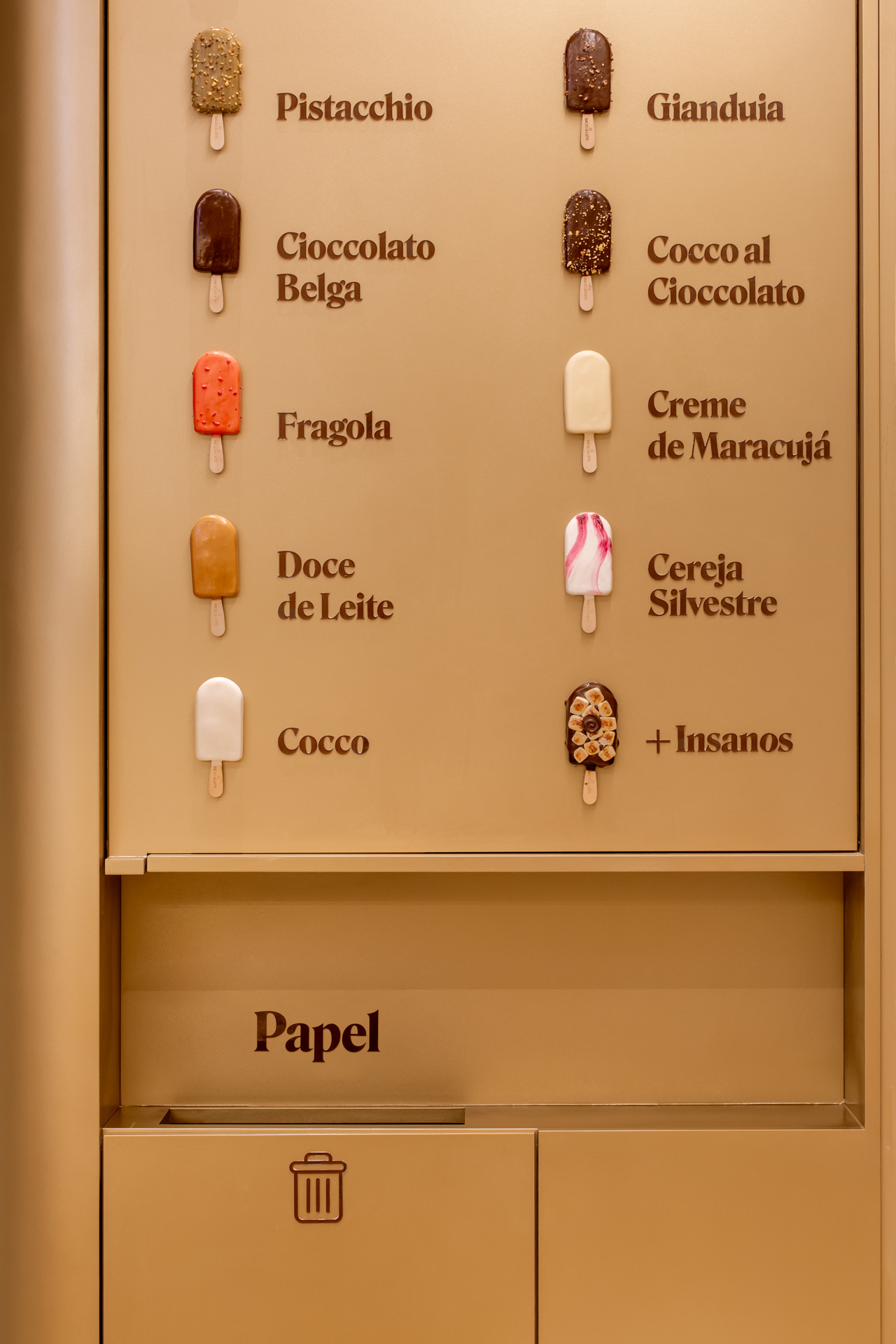
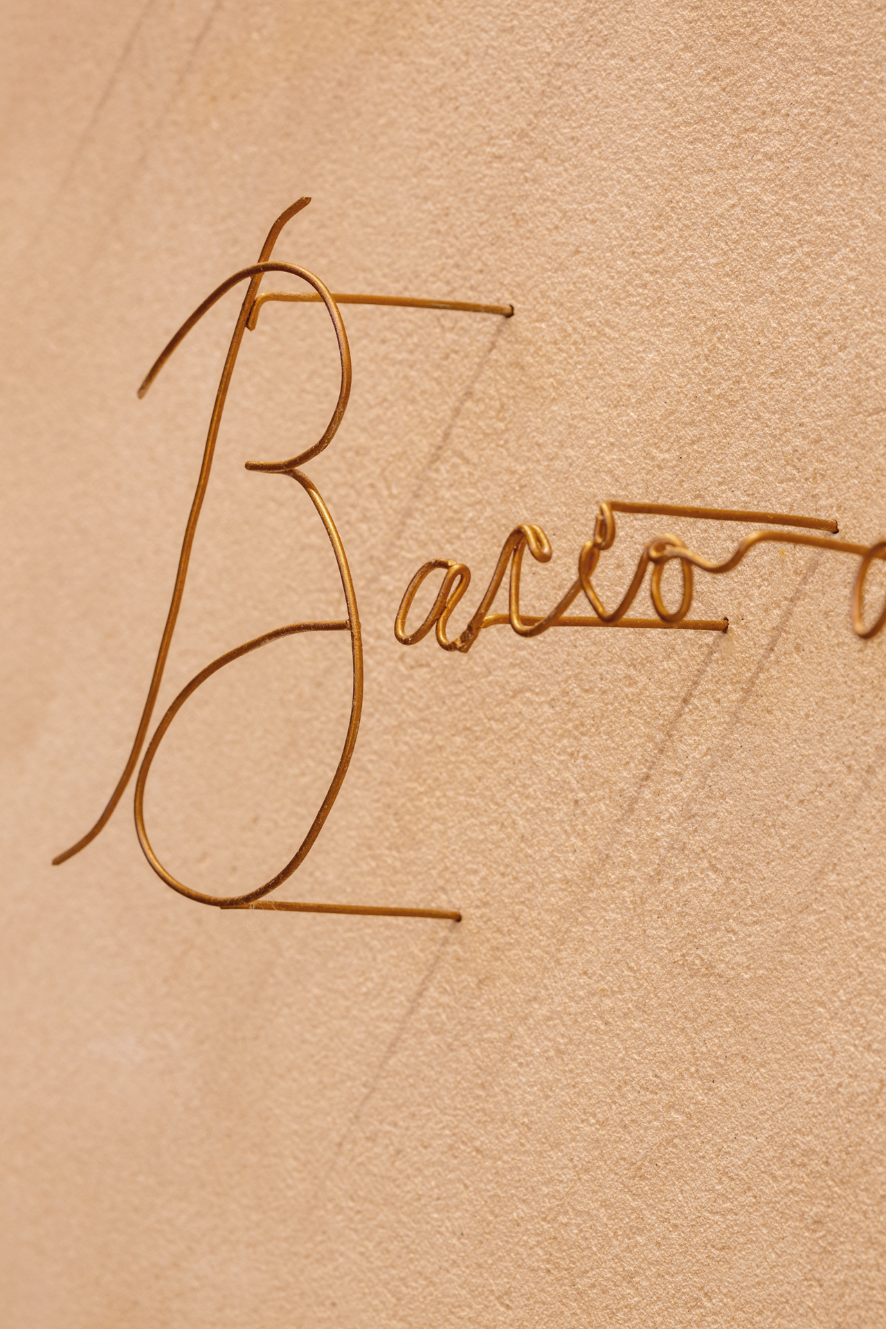
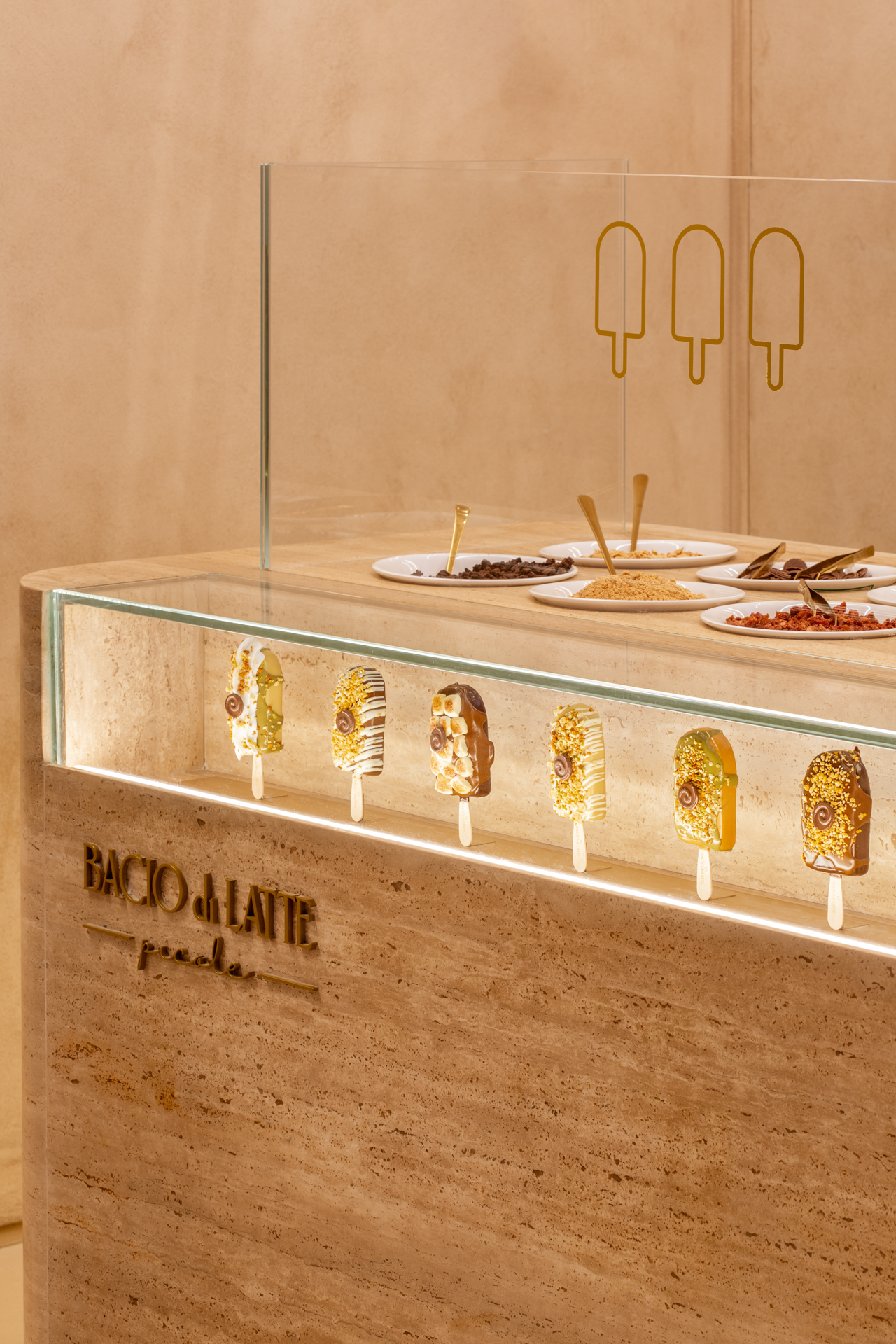
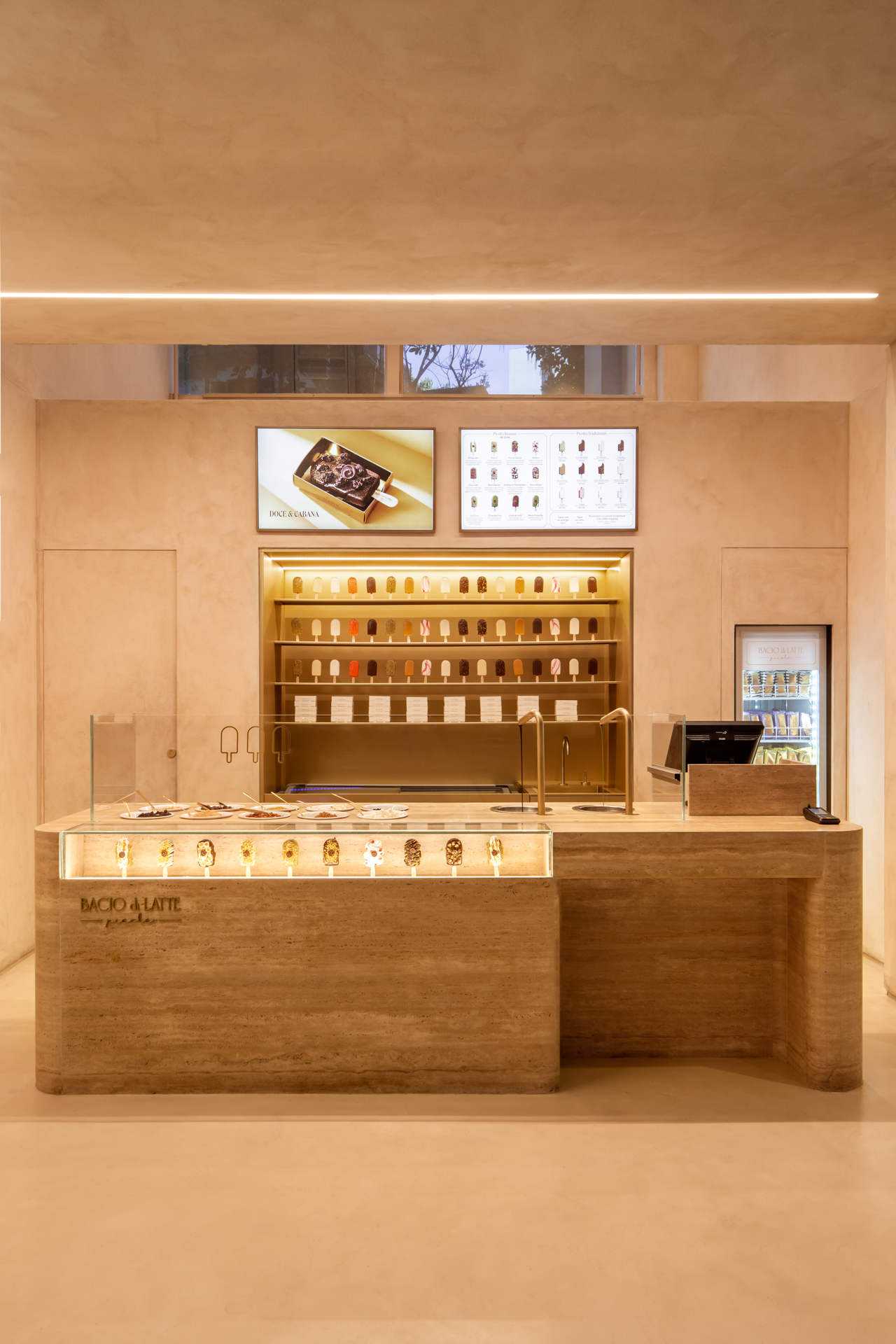
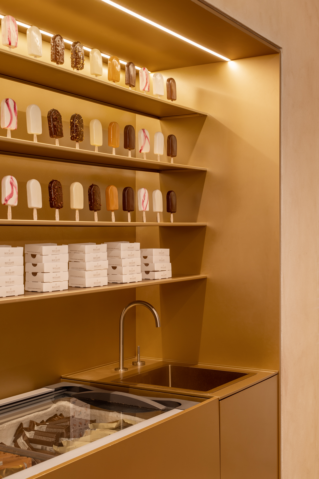
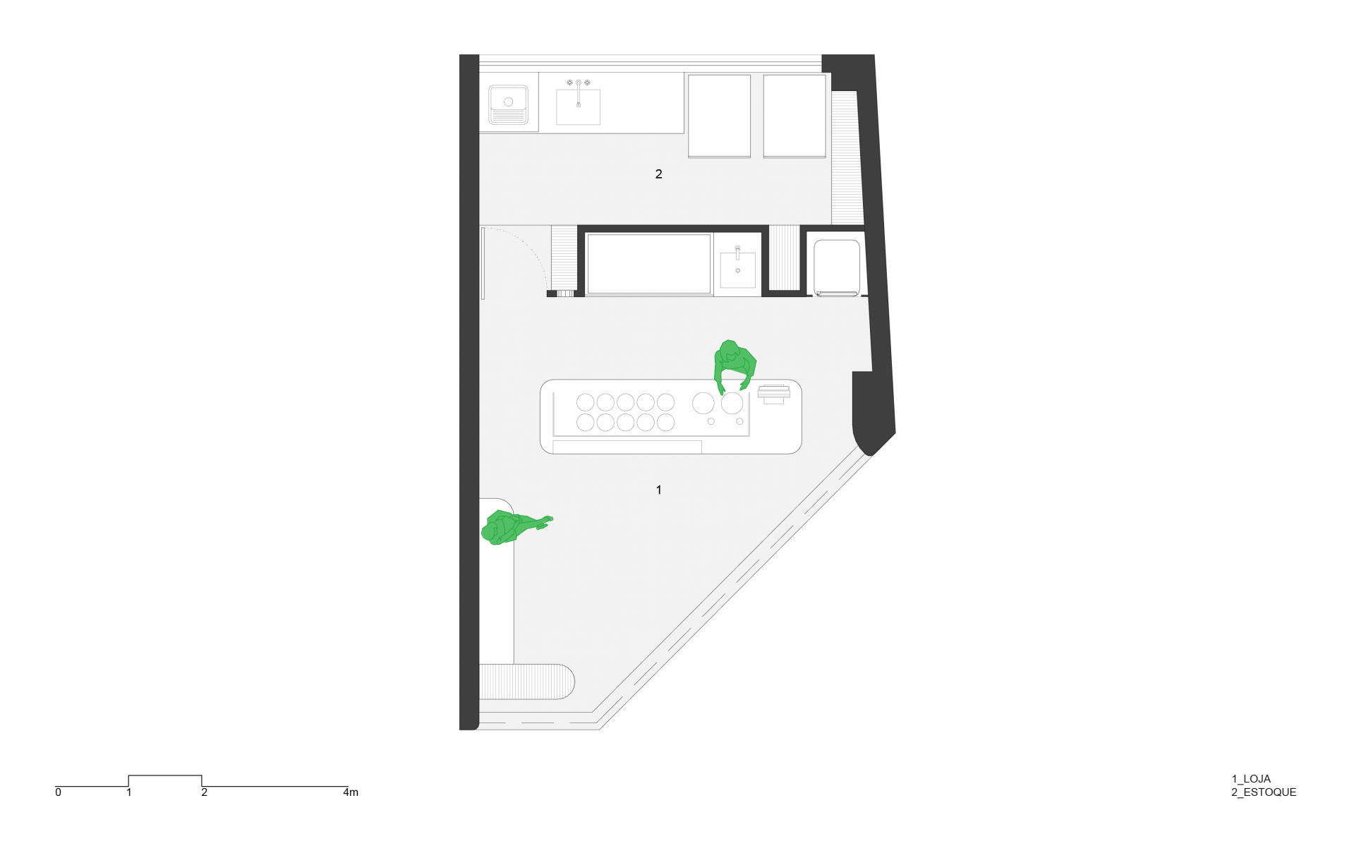
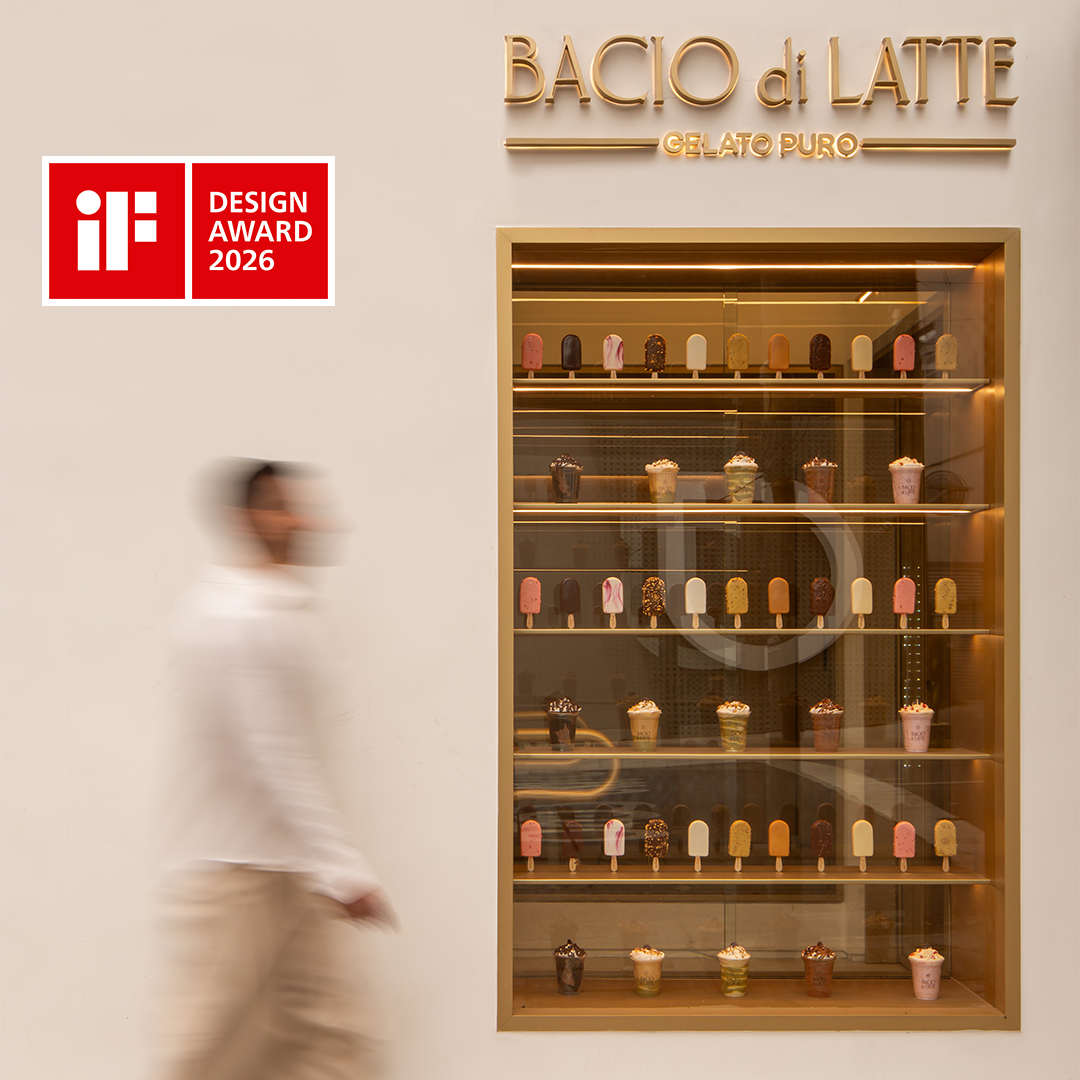
Inspired by the creaminess of ice creams, the new concept for Bacio di Latte's first Insane Popsicle store brings monochromatic ambience and timeless sophistication as design bases. The repetition of popsicle mockups adds a touch, being the unusual and fun point of the decor. While the monolithic floor, textured walls and ceiling make a neutral set in contrast to the Travertine marble and golden metal. The facade is pure, white as milk, with the vertical element in golden metal and illuminated popsicle playing to hide and reveal the store little by little. As Italian as the gelatos, Travertine is the protagonist. The accessible bench, rounded and loose in the space, has a display of popsicles like irresistible jewels, with a shape and toppings imitating real flavors. At the back of the counter, the wall that divides the service from the backoffice goes up to half-height so that the window at the back appears, bringing natural light. The symmetrical golden niche, below the digital menus, interrupts the textured wall. The proposal highlights the purity of the materials and the minimal composition of the elements, which, with the necessary softness, support the explosion of colors and flavors of the popsicles.
Inspired by the creaminess of ice creams, the new concept for Bacio di Latte's first Insane Popsicle store brings monochromatic ambience and timeless sophistication as design bases. The repetition of popsicle mockups adds a touch, being the unusual and fun point of the decor. While the monolithic floor, textured walls and ceiling make a neutral set in contrast to the Travertine marble and golden metal. The facade is pure, white as milk, with the vertical element in golden metal and illuminated popsicle playing to hide and reveal the store little by little. As Italian as the gelatos, Travertine is the protagonist. The accessible bench, rounded and loose in the space, has a display of popsicles like irresistible jewels, with a shape and toppings imitating real flavors. At the back of the counter, the wall that divides the service from the backoffice goes up to half-height so that the window at the back appears, bringing natural light. The symmetrical golden niche, below the digital menus, interrupts the textured wall. The proposal highlights the purity of the materials and the minimal composition of the elements, which, with the necessary softness, support the explosion of colors and flavors of the popsicles.
-
LocalizationSão Paulo, SP
-
Area30m²
-
Project Year2023
-
End2024
-
PhotosCarolina Lacaz
